4 Ways to Control Light For Interiors Photography
When it comes to image making, I prefer using natural light. However, it doesn’t always result in outstanding images. Sometimes, the ideal lighting occurs at a specific time of day, adding a unique design element. However, scheduling constraints and subpar lighting in certain rooms can pose challenges. This is why controlling light for interiors photography is important.
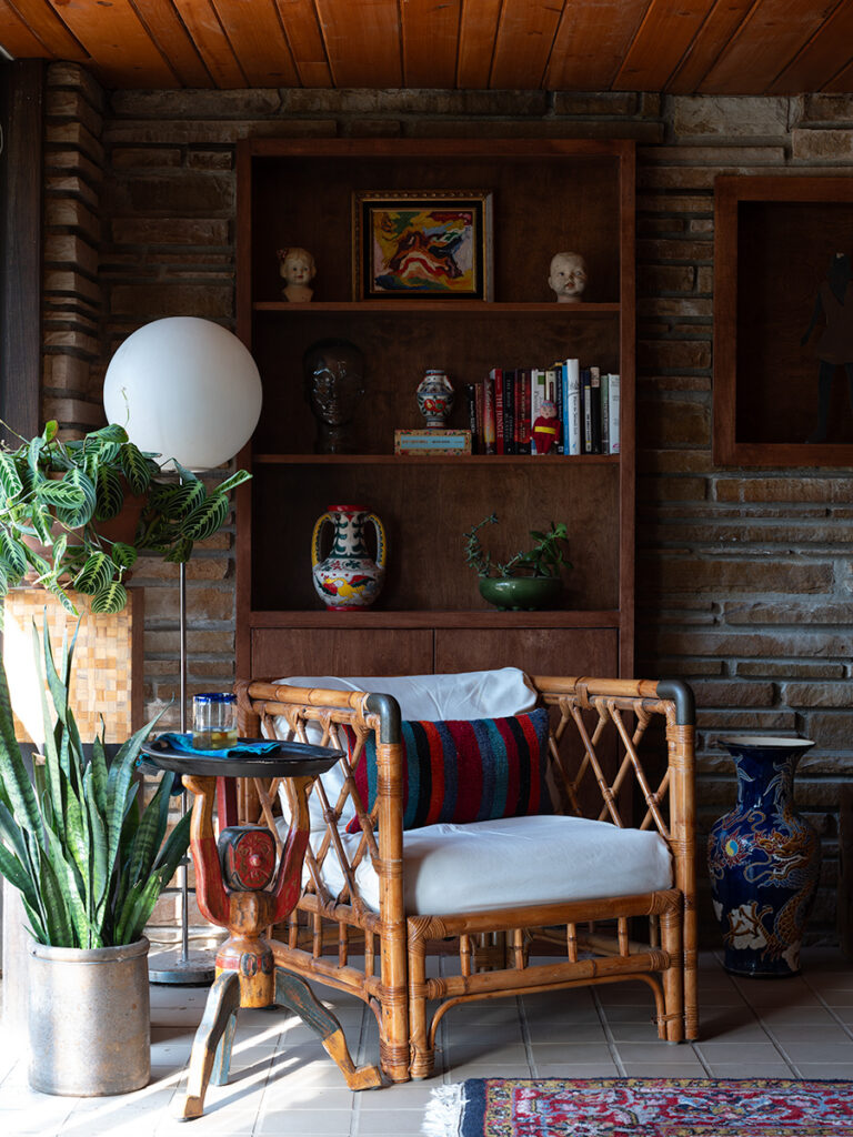
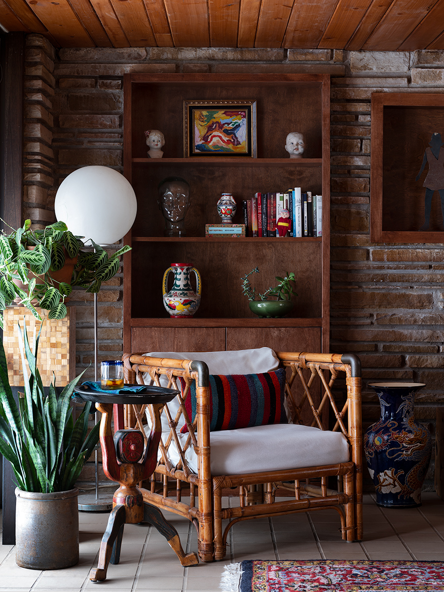
For this post, I had the opportunity to employ four different methods to control lighting for interiors photography. At the end, you’ll find two images: one captured with natural light and no retouching, and the other modified and retouched. These comparisons demonstrate that the natural light may seem fine at first glance. However, by addressing these issues, subtle changes contribute to positive effects on the final image.
Diffusion with a Butterfly, Overhead or Rag
Let’s delve into the lighting situation: On the left side of the shot, there are sliding doors with a cantilevered roof above them. The concrete outside reflects light, causing the bottom of the image to be heavily lit while the top remains dark. Unfortunately, the only available shooting time was when some light spilled in, but it wasn’t visually appealing.
To address the incoming window light, I utilized a Butterfly, Overhead, or Rag, which is a large fabric used to modify a light source. In this case, I used an 8×8 ft 1/4 Grid to cover the sliding doors. This achieved two objectives: diffusing the directional light and creating a more balanced lighting from top to bottom. While I would have preferred a proper China Silk, it wasn’t financially feasible (only $500 from B&H). If you’re interested in learning more about different diffusion materials, check out this video.
Filling in Shaddows with a Strobe
The bookcase presented a challenge with trapped light. While aiming to maintain a natural overall lighting feel and preserve the contrast of darker shadows, my goal was to only add a bit of light to the bookcase. To address this, I positioned a softbox just out of frame to the camera’s right, directly aimed at the bookshelf. Placing the softbox close ensured greater light falloff, effectively keeping the light where I desired. It’s important to note that moving a light source farther back not only spreads the light out but also enhances consistency in terms of illumination, reducing falloff. Google the inverse square law if you want to learn more.
In any case, this approach yielded favorable results, although there were a few areas in the image where I wished for a stronger pop of light requiring yet another method of light modification.
Bouncing Light with a Reflector
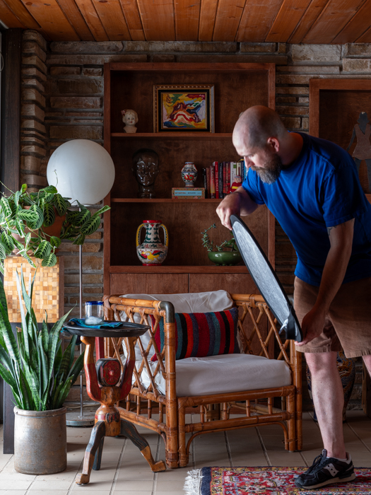
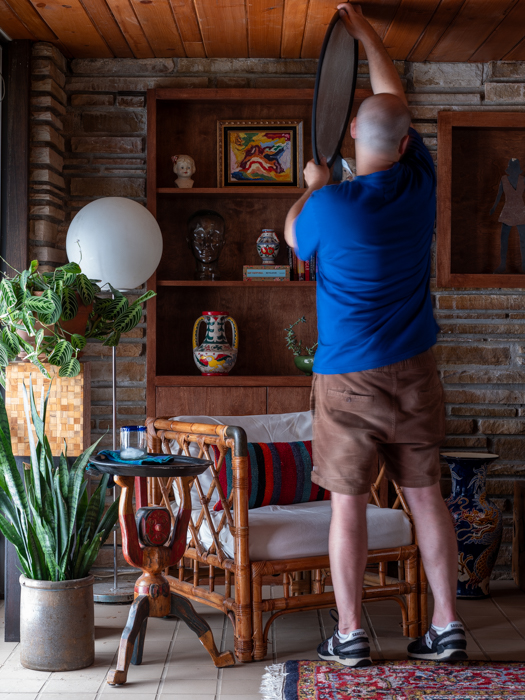
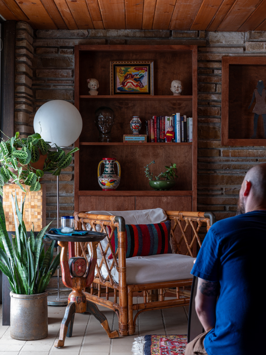
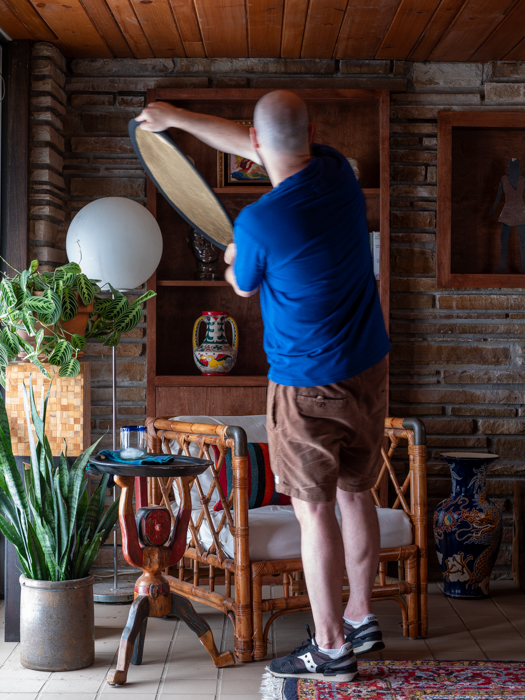
Now, let’s discuss another technique employed to enhance specific objects: I utilized a small silver and gold reflector to add a touch of light. Although a white reflector would have been preferable, I made do with what I had available. The advantage of a small reflector is its ability to direct light to a specific area, granting flexibility in highlighting or controlling reflections on targeted objects.
In the top four images of this post, you can observe the reflector’s usage. The first and third images bounced light onto the wooden drink stand, while the second image addressed the trapped light in the top left corner of the room. Lastly, the fourth image introduced a splash of light to the prayer plant on the stand. These elements were combined in Photoshop using layer masks to precisely control the extent of the blend.
Subtracting Light
Subtracting light in photography refers to the deliberate reduction or removal of light from a scene or subject to achieve a desired effect. This technique involves employing various methods or tools to decrease the intensity or brightness of light in specific areas, allowing for better control over the overall lighting and exposure of an image. In the context of interiors photography, subtracting light often entails blocking off windows.
In this particular scene, both sides of the room have clerestory windows, which are positioned above eye level to let natural light enter a space. To fully utilize a single large light source, I chose to block off all the clerestory windows using contractors plastic. However, in future instances, I plan to explore smaller, fabric-based approaches to subtract light more effectively.
Previsualization and Final Thoughts
A last thought to consider is Ansel Adams’ ideas of previsualization. Initially conceived for old school darkroom/film photographers, previsualization involves visualizing the final image in one’s mind before taking the shot, considering the desired lighting, composition, and overall mood. By applying this concept, photographers can anticipate the specific lighting conditions they need to achieve their vision and plan their techniques accordingly. Adams’ meticulous approach to previsualization empowers photographers to create precise and intentional lighting setups, ensuring that every element of the image aligns with their artistic intent. It doesn’t take much to see how previsualization can be applied to any type of photography – particularly architecture and interiors.
In the end I always feel I have so much more to learn. For myself I feel I need to push my lighting techniques with the ability to previsualize the final result to elevate my work and produce truly impactful and visually stunning photographs. Hopefully this post will help others a little with some insight into the interplay between light and shadow that photographers can create to make captivating images. Whether it’s through the use of diffusers, reflectors, or blocking off windows, the goal is to achieve the perfect balance and create images that truly stand out.

Hi! I'm Bradley Phillips
